
Why Is User Experience (UX) the New Search Engine Optimization (SEO)
Have you updated your website yet? Have you noticed a drop in your visibility or got a notification from Google that your website needs to get fixed? Need marketing tips for your website?
It is no secret that SEO’s entire landscape is going through a radical change. Local listings are going through massive changes as well along with regular algorithm updates, so much so that keeping up with them can get quite tricky at times. No need to worry, however, as I will discuss with you in detail how you relieve the burden.
Users First, Aesthetics Second
A common mistake I have noticed people making are that they tend to become overly obsesses with how Google works to bring users to their website. What they seem to ignore is that the platform favors people who create great content, and outstanding experience. This is measured by the time users spend on your website and other factors including your Google reviews
Wait, Google reviews affect my SEO? Yes.
When you focus on creating the best user experience is far more beneficial in the long run in comparison to stuffing keywords and attempting to trick Google to improve your website’s ranking.
Google is no longer the keyword rewarding haven that it used to be. Now it cares more about providing users with excellent user experience. Don’t believe me? Check Google’s webmaster guidelines. Google’s ultimate goal is to give users the best possible search engine experience, letting them find the exact content or website they are searching.
Quite often, you will find people hiring web designers to improve their website’s appearance and visibility. In most cases, web designers have little to no knowledge regarding SEO strategy. Some of them don’t even have the slightest idea of attracting paying customers online.
So what do they end up doing?
Well, most of them usually install a lackluster template and ask their client to give them some relevant keywords to create their website. Essentially, there is no marketing strategy or planning whatsoever.
For most of my clients, I lead development and web design for their websites. The first aim I have for every website is improving its user experience and visibility, and second, it’s to add long tail keywords to conform to Google search. This isn’t a process based on what I think. Luckily we have access to data that allows us to create a solid content marketing strategy that brings profits. Remember, SEO is not about choosing keywords.
Some of you might not know this, but user experience and SEO sometimes go hand in hand. Incorporating inorganic keywords with a subpar design is a disaster waiting to happen. So yes, optimize the design for SEO, just like I do. Also incorporate all the basics of UX for improved marketing.
What Is UX (Think Amazon)
For those who do not know what user experience is, let me explain it to you in the simplest and most relatable way I can. In a lot of cases, I have seen people use UX interchangeably with “Usability” and “User Interface Design”. Although both of them are crucial aspects of user experience design, they are merely its subsets. UX covers a wide array of several other areas as well. A UX designer who is worth his or her salt concerns themselves with the total process of integrating and acquiring a product including function, usability, design, branding, and various other aspects. UX’s story begins way before the users even hold the device in their hands.
Let us use Amazon’s UX as an example. The company was not in the best of places initially. It had its fair share of ups and downs. So what changed? Well, the company started focusing on its UX. We can learn a lot from the UX of the world’s biggest online seller.
See the image below. Amazon adds categories that are friendly. You don’t even need to click. Just swipe and find what you want!
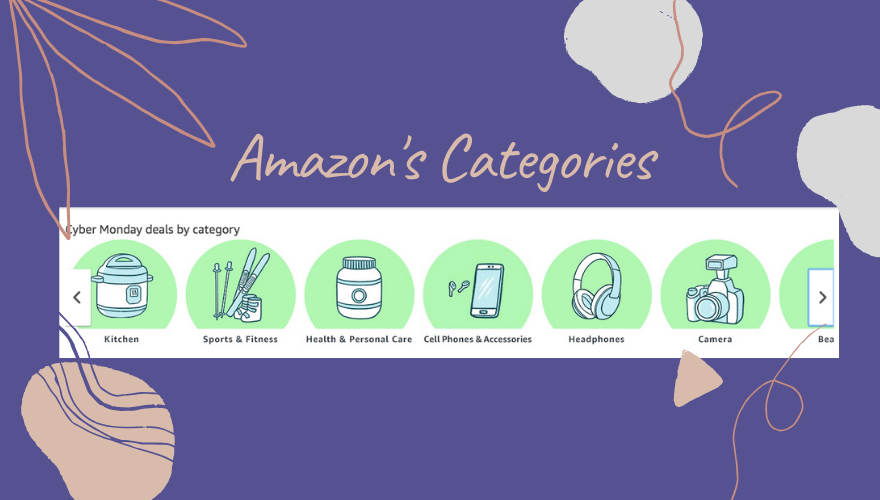
Since the company improved its UX, its revenue entered the Billion Dollars club. In 2018 alone, the company bought in around 260 billion in retail sales, which is close to 50 percent of the United States’ online expenditure for the year. The crazy part about that it was not just a one and done thing. Amazon has been on the up and up since then, and is responsible for half of United States’ retail sales for the last couple of years. What’s the reason behind this success, well; it’s the user friendly experience.
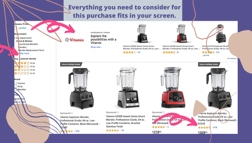
Everything you need to make your decision is right there! Again, no need to click!
You might be wondering what’s so great about Amazon’s UX that led it to become a giant in the online retail industry. Well, let us look at some noticeable strong points from its UX.
1. It is a Search Engine Marketing Driven UX
This company’s UX is specifically designed for increasing the chances of visitors buying something whenever they visit their website or app. Prominent search bars on every single page is a huge reason why people often end up buying something when they go to Amazon. In addition, the platform also refines and filters every search result in a comprehensible and open fashion.
The company’s state of the art search function benefits from an algorithm that personalizes content according to all stages of the buyer. It gives them relevant recommendations, which makes their current and future purchases quite convenient. I’m sure most of you have seen the Amazon’s home page (if not, what are you even doing). Most of its elements have the influence of search functions, which includes:
– Shopping carts
– New products
– Recent browsing history
– Personalized recommendations
When users come across relevant products, they find a clear path to purchase without any hassles or second guessing. Because Amazon’s UX focuses on personalization, visitors not only get a tremendous site experience, they also become loyal customers. Essentially, the reason behind Amazon’s UX success is that everyone knows how to do basic online searching. It does not matter whether visitors open Amazon with a specific product to purchase. But, the sites easy usability and first rate user experience caters to everyone.
The best part about Amazon’s UX is that it caters to both younger and older generations. Those who do not know how to follow online visual cues just have to click the product boxes present on the home page. The boxes appear as the product image as well as a blue hyperlink, which helps to convert and accommodate all users. The company’s text oriented and linear UX approach runs on usability and personalization.
2. Amazon’s UX Reassures Buyers
In order to improve their conversion rate, Amazon conducts regular split tests on its product pages. The adjust page elements to increase trustworthiness, value, and convenience. It reduces buying friction and increases sales by tenfold. Take a closer look at product pages on Amazon, and you will notice that there is lots of whitespaces to emphasize on the key selling points of the product. You will also see that the product rating is directly underneath the product to highlight social proof and guarantee visibility for validating the quality of purchase the user will most likely make. The product’s benefits are just adjacent to its image, which makes it look more credible.
When you go to the order detail side, you will see bold black text that says “Free Delivery,” and “Free Shipping.” Amazon is well aware that their customers want their products delivered fast and for cheap. The company incorporates these power phrases in its platform’s UX to prompt action, while also reassuring people speedy delivery with savings.
In situations, when an item is expensive, signing up for the company’s reward Visa program allows shoppers to avail a 50 Dollar discount on their purchase. So, it is quite clear that every element on Amazon’s page is there to reinforce positive sentiments for every purchase no matter how pricey or cheap. Amazon also highlights key benefits on its product pages to reassure shoppers, essentially optimizing their conversion rates.
The UX Essentials in Website Design
We spend hours and hours online using web apps, navigating websites, and reading news online. In several cases, you do not get the best online experience. Why does that happen?
Well, it is because of poor designs that do not take user experience into account. Sure, you can spot design errors from afar; however, things get slightly trickier when the person handling the project is yourself. I have found myself in such situations more than I’d care to admit.
Be that as it may, designers are responsible for creating an excellent design to improve user experience no matter how difficult it is.
Let us look at some UX best practices that you can incorporate in your website:
1. User-Centric Design
Just forget what the website has to say for a bit and redirect your attention towards user experience.
Put yourself in the shoes of a future buyer that is in the awareness stage (they don’t know anything about your products or services) Can your website inspire them?
Then, think about the future buyer that is in the consideration stage (they know they have a problem but they are not looking to buy today) Is your website engaging? What can we offer them to motivate them to come back?
Put yourself in the shoes of a future buyer that is in the decision stage. They are looking to solve a problem. Can your website educate them so they can make the decision faster?
Then, Text, layout, graphics, and other interactive elements work synergistically for presenting users with first-rate experience rather than information. If you focus on making your page unique in the face of tons and tons of information and websites on the internet, you will most likely have excellent conversion rates.
Most modern websites these days contain interactive and visual qualities that seek emotional responses to stand out in an utterly competitive online world. Just make sure you select a website that gives your future users the experience they expect.
For example, if you are an Eye Care Doctor, you won’t have a website that looks like a Fashion Boutique. If will distract your users from reading your content.
2. The Fine Line between Creativity and Common Designing Elements
The last things you want for your website are reinvented design elements. It causes users difficulty in figuring out the UI interface. Instead, focus on having an interface that looks familiar and eye-catching at the same time. Do not relocate or change elements like login access, link placement or other standardized components.
Sure, going for a non-traditional design does seem like a cool idea, but ultimately, it falls flat on its face because most users do not have the slightest idea of what to do with it. Therefore, try to strike a balance between usability and creativity. Less is more.
To show you how big of a misunderstanding there is, I’ll ask you this question: which pop-up do you think was more successful?
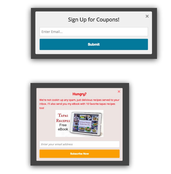
Guess what?
The first pop-up performs over 30% better!
You might think the bottom one should’ve won. It follows all the common pop-up best practices. It has:
- An image that serves as a CTA
- A provoking headline
- Bright colors
- A great giveaway.
Why the first pop-up won? It has four words and a button that says “Submit”. You must make it easy for your users if you want them to take action!
3. People Prefer Scannable Websites
Although having readable content is well and good, not everyone has the time or energy to go through every word written on your website. Especially your home page.
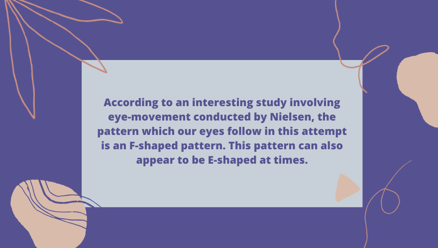
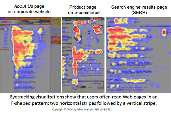
According to an interesting study involving eye-movement conducted by Nielsen, the theory that internet users are prone to read content in the form of chunks is supported. The pattern which our eyes follow in this attempt is an F-shaped pattern. This pattern can also appear to be E-shaped at times.
This naturally means that a web design loaded with tons of content is a big No-No.
If you want your users to ‘read’ your services rather than skim through them, make sure to follow this tested pattern.
4. The Importance of Establishing Visual Hierarchy
Your visual design should highlight essential interface elements in a way that attract the user’s focus. When it comes to design, there are various ways to highlight these things.
Using a single color and changing the font size to emphasize or highlight any particular service induces a welcoming effect on the user.
5. Users Value Simplicity and Clarity
It takes no more than half a second for users to evaluate a website’s design. Therefore, it is important that you determine what will catch their eye at first glance. Make action buttons easy to find instead of placing them at awkward areas.
Also, keep making constant reevaluations to see whether there are other improvements you can bring to your site or app. Website designs should always be easily usable for users while adding extra functionality according to a user’s needs. Do not make extra functions appear all at once as it can be quite distracting. Everything should be consistent, simple, and clear. A website’s visual aesthetics can make navigation quite easy for users as it allows them to figure out colors relevant to specific areas of the interface.

6. Knowing What the Audience Wants
Sounds like obvious, but your website development should start with defining your audience. You should be well aware of the audience you are creating the website for as it helps to incorporate relevant functions and content to attract the user.
Once there is a clear picture of the audience, designing the site will become remarkably more straightforward. You can also take some inspiration from your competition; however, make sure that your identity is unique. It would also be wise to incorporate user feedback in your web or app design. Considering actionable feedback from the end-user is extremely valuable.
7. UX Qualities for Your Consideration
At its core, user experience is what you provide to your consumers. Focusing on the basics will help you accomplish your goal of improving your website’s user experience. Let us look at some key points that will help you get started:
– Make sure that your content is original and useful. It should be there to assist the users and fulfill their needs.
– Your system should perform smoothly, page load time should be quick, especially when users interact with it. Make sure that everything in your site flows smoothly and does not have hindrances.
– Improve your site’s efficiency. Users should be able to accomplish repetitive tasks easily and quickly, without any worries.
– Everything on the website should be there to delight the user. It should establish an emotional connection with them that eventually leads them to investing in the product.
– Make your websites content and interaction moves seamlessly moves through the product. Users should find no difficulty or hindrances when it comes to learning about the product. Users should be able to accomplish their goals on subsequent visits.
– Make the site easily discoverable; users should be able to achieve their task on their first visit.
– Do not make the website seem distant and robotic. Try to make it as humanly relatable as possible. Be approachable, transparent, and trustworthy. Also, opt for human interaction over machines.
– You must provide users with context so that they know where they are in the interface
– Credibility is of extreme importance. You have to make users trust and believe what you say.
– Make your content as easily accessible as possible, especially for people who have specific disabilities. Don’t forget your “contact us” page!
– The website’s usability should be simple and easy. Also, users should be able to find it easily.
– All of the content on the website should be easily navigable and locatable onsite as well as offsite.
– The website’s design elements should bring about appreciation and emotion.
8. A Common SEO Myth
There is a colossal myth associated with SEO that irks me to no end. I want to bring an end to this. People think that SEO backlinks, meta tags, and keywords are surefire ways to lure in profitable users. That is not the case! In fact, there are no guarantees whatsoever.
It is entirely possible that the hits you are getting from your website are from various countries where you do not even have clients. A large number of people use mobile devices to conduct their searches.
It is glaringly evident that the online mobile market has taken over in the past few years. Therefore, you need to optimize your website for mobile browsers if you want to improve your site’s visibility on search engines. If you are not confident on how the website will measure up, go to Google and enter the URL of your website in its mobile friendly test.
9. Using Marketing Analytics to Optimize User Experience
Pay attention to analytics. Hey can make or break your website’s success. User explorer from Google Analytics, in particular, provides in-depth information regarding every user’s engagement with your website. As soon as you lay your eyes on this data, you will instantly know what your audience likes and what it does not like.
Pay attention to creating consistent, qualified traffic. Five hundred users for every month should be your goal. However, before you start, generate tons of clickable pages and banner ads to attract users.
The more metrics you have at your disposal, the more data you have regarding your content. It will be of tremendous help in reaching your 5000 users goal.
Now that you know everything you need to know about excellent UX, there should not be anything stopping you from making a world-beater of a website.
Want to discuss in detail your website’s UX and SEO? Schedule a call!